



The Varney Agency is a 3rd generation family run insurance broking business that had personal and business clients predominantly in Maine, and a brand that reflected that. This suited them very well right up until they began speaking to property owners in New York. At that point it became apparent they needed a new look that could support their business strategy.
A brand that’s all about finding a better way
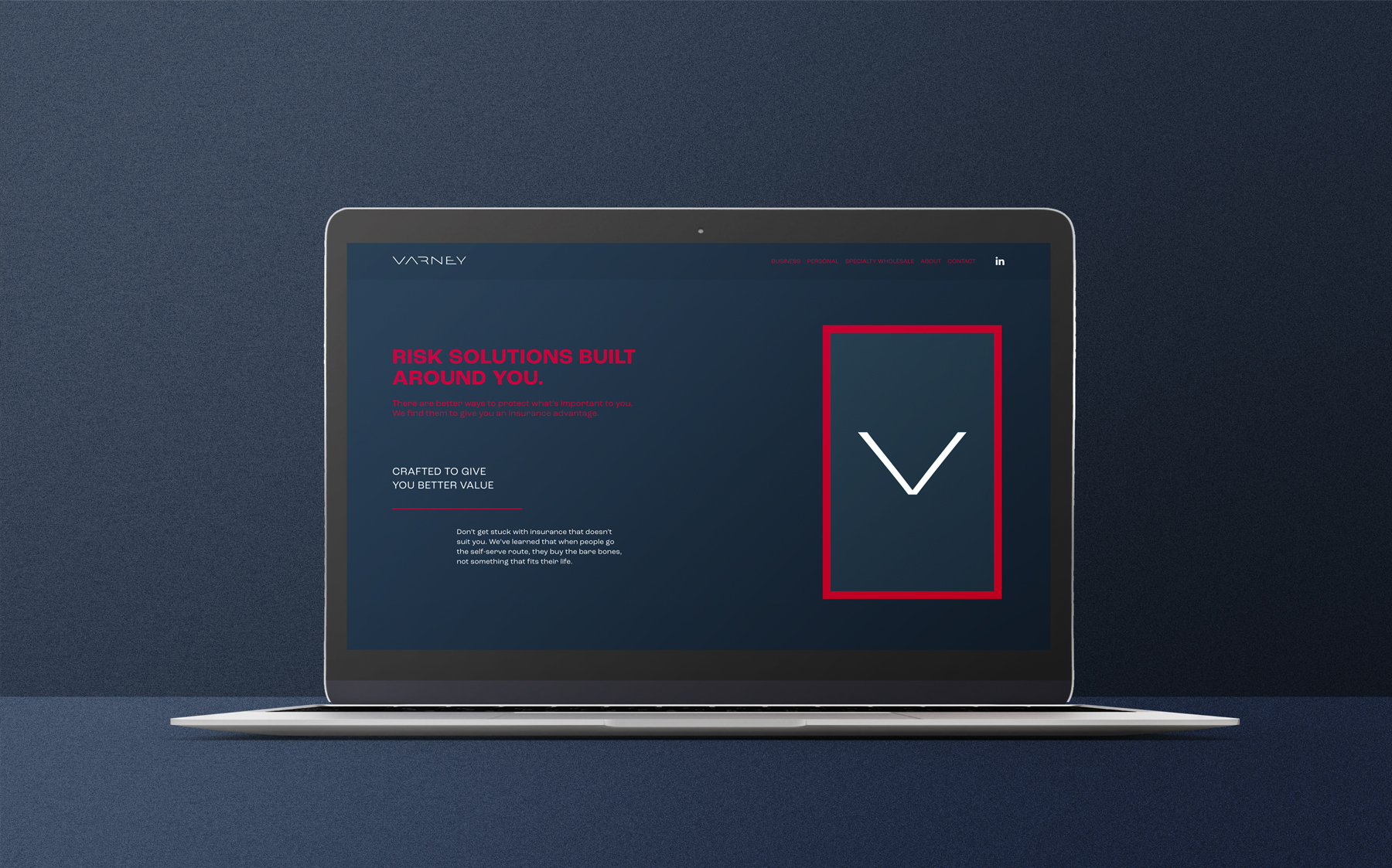
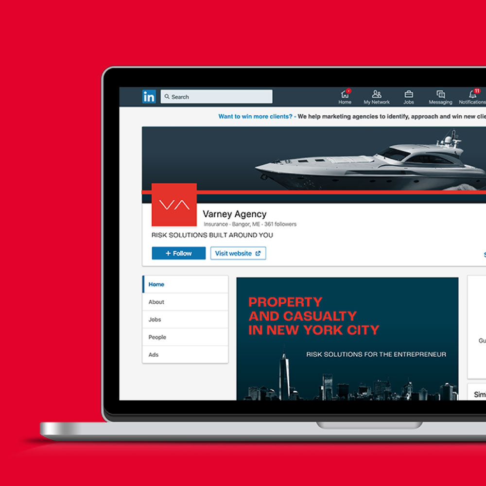
After running our brand and value proposition workshops, it was clear what Varney was about and why they were different. Their business is all about finding products and services that add value to their clients. New, smart ideas that give their clients an advantage. We summed that up with the headline, “Risk solutions built around you.”
An identity that inspires confidence
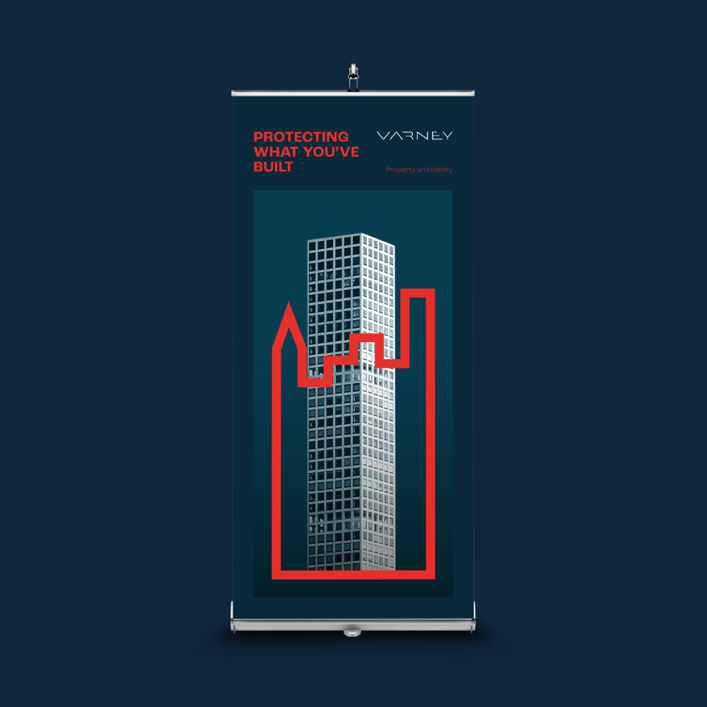
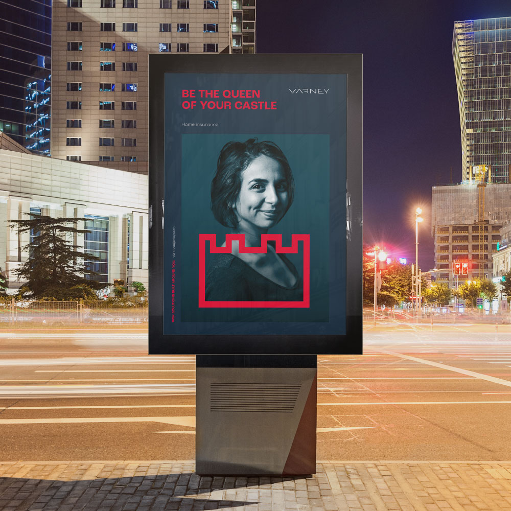
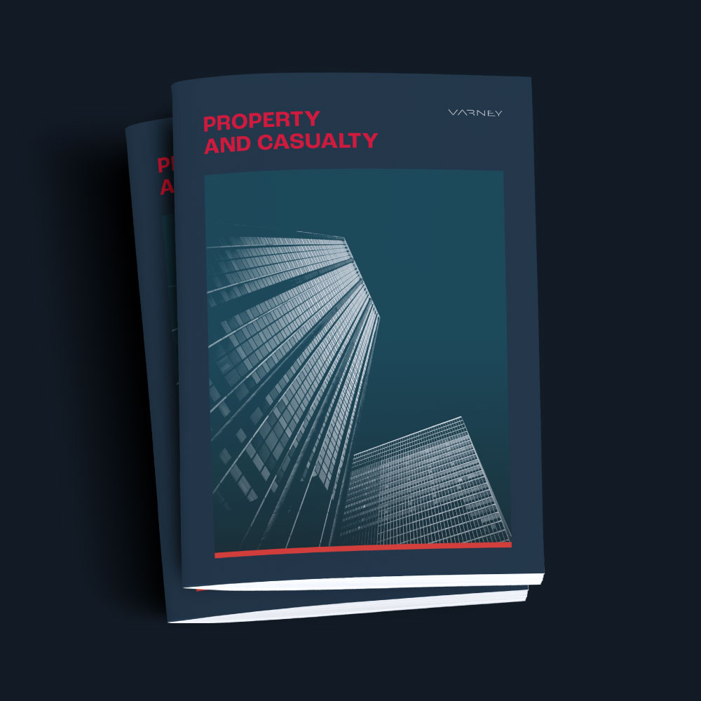
The Varney identity was updated to reflect the forward thinking, modern business they now were. The logo, contrasting colourways and duotone photography create a striking brand image. Its simplicity exudes confidence, giving the team the back-up they need when meeting potential new clients.
A website that speaks directly to their audience’s challenges
Although the primary goal for the rebrand was to enable the team to develop new business opportunities in New York, their website would, of course, need to communicate with all their existing personal and business clients in Maine too. So, as well as flexing our messaging to speak to their needs, we made sure Varney’s roots were proudly displayed. That’s why, on the About page, we tell the story of how their belief in doing their best for their clients took them from a single location up in Maine to serving clients as far south as Puerto Rico.
